
To create a responsive layout with CSS Grid and Flexbox, start by designing a flexible container with `display: flex` or `display: grid`, then place your content inside. Use media queries to modify properties like `flex-direction`, or `grid-template-areas` as the viewport narrows. This combination ensures your layout adapts seamlessly across devices. Keep experimenting with different configurations, and you’ll discover how these tools work together to build beautiful, responsive websites.
Key Takeaways
- Combine CSS Grid for overall layout structure with Flexbox for aligning internal elements.
- Use media queries to adjust grid and flex properties based on device width for responsiveness.
- Define grid areas and tracks to create flexible, adaptable layouts across different screen sizes.
- Apply Flexbox properties like `justify-content` and `align-items` within grid containers for alignment.
- Test and refine breakpoints to ensure seamless transition and optimal usability on all devices.

Have you ever wondered how to create flexible, adaptable web layouts that look great on any device? The secret lies in mastering CSS Grid and Flexbox, along with using media queries to fine-tune your design for different screen sizes. These tools let you craft layouts that respond smoothly to varying viewports, ensuring your site remains user-friendly and visually appealing whether someone’s on a phone, tablet, or desktop.
Start by understanding how media queries work. They allow you to apply specific CSS rules based on device characteristics like width, height, orientation, or resolution. For example, you can set a layout to appear as a multi-column grid on large screens but switch to a single-column layout on smaller devices. When writing media queries, think of them as breakpoints—points where your design adapts for better usability. You might write something like `@media (max-width: 768px)` to target tablets and phones, then adjust your grid or flex settings accordingly.
Flexbox is incredibly powerful for aligning content within containers. It simplifies the process of vertical and horizontal alignment, especially when combined with media queries. With flex alignment properties like `justify-content` and `align-items`, you can easily control how elements distribute and align within their parent containers. For example, on wider screens, you might want items to be spaced evenly with `justify-content: space-between`, but on smaller screens, switch to `center` alignment to keep things tidy. Using Flexbox makes your layout more adaptable because you can change alignment rules dynamically based on screen size.
To implement this effectively, start with a flexible container using `display: flex`. Inside, position your items and set their alignment properties. When you add media queries, you can override these properties to change the layout or alignment for different device widths. This approach ensures that content remains accessible and visually balanced no matter the device. Remember, the key is to combine media queries with flex alignment strategies, so your layout adjusts seamlessly without breaking or becoming cluttered. Additionally, understanding responsive design principles helps you create layouts that are both functional and aesthetically pleasing across all devices.
HTML & CSS Manual for Beginners 2026: Build Real Websites from Scratch – Master Modern HTML, CSS, Responsive Design, Accessibility and a Lot more with Hands-On Projects
As an affiliate, we earn on qualifying purchases.
As an affiliate, we earn on qualifying purchases.
Frequently Asked Questions
How Do I Choose Between CSS Grid and Flexbox for Specific Layouts?
You choose between CSS Grid and Flexbox based on your layout‘s complexity and alignment options. Use Flexbox for simple, one-dimensional layouts like navigation bars or buttons, where you need flexible alignment. Opt for CSS Grid when your design involves two-dimensional structures, such as page grids or complex arrangements, offering more control over rows and columns. Consider your specific layout needs to decide which method provides the best alignment options.
Can CSS Grid and Flexbox Be Used Together Effectively?
Yes, CSS Grid and Flexbox can be used together effectively through grid integration and flexbox compatibility. You can design complex, responsive layouts by applying grid for overall structure and flexbox for aligning items within grid cells. This combination offers flexibility, allowing you to leverage each layout system’s strengths. Just make certain you understand how they interact, and you’ll create seamless, adaptable designs that respond well across devices.
What Are Common Pitfalls When Using CSS Grid and Flexbox?
When using CSS Grid and Flexbox together, you might encounter common pitfalls like overlapping content if you don’t carefully plan your layout. Browser inconsistencies can also cause issues, especially with older versions that don’t fully support some Flexbox or Grid features. To avoid these, always test across multiple browsers, double-check your grid and flex container settings, and use fallback styles for better compatibility.
How Do I Ensure Accessibility With Complex CSS Layouts?
Prioritize practicality by providing clear, consistent color contrast to keep content accessible, and guarantee keyboard navigation is seamless. Use semantic HTML elements and ARIA labels to support screen readers. Position focus indicators prominently, and test thoroughly across devices. By balancing bold visuals with basic accessibility principles, you make your complex CSS layouts both engaging and inclusive, creating a user-friendly experience for everyone.
Are There Performance Considerations for Large or Dynamic Layouts?
You should consider rendering performance and layout reflow when working with large or dynamic layouts. Complex CSS Grid and Flexbox structures can slow down rendering, especially during frequent layout changes. To optimize, minimize unnecessary reflows by batching DOM updates, avoid excessive use of animated properties, and use will-change sparingly. Properly structuring your CSS and reducing layout thrashing helps maintain smooth performance even with complex, dynamic layouts.

Responsive Web Design (Brief Books for People Who Make Websites, No. 4)
As an affiliate, we earn on qualifying purchases.
As an affiliate, we earn on qualifying purchases.
Conclusion
Now, as you craft your web layout, think of CSS Grid and Flexbox as the guiding stars and steady compass on your journey. They shape your design like a river carving through rock—smooth, purposeful, resilient. Embrace their flexibility and structure, letting them dance together to form harmony in your creation. With each line of code, you’re weaving a canvas that adapts and breathes—an open door to endless possibilities and beautiful, responsive stories.
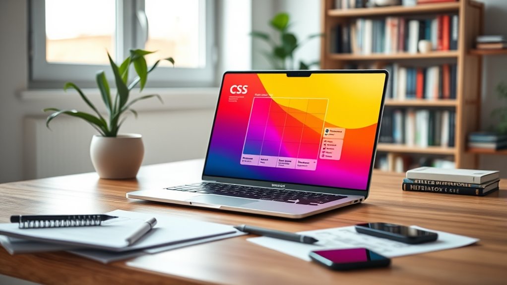
CSS layout grid flexbox kit
As an affiliate, we earn on qualifying purchases.
As an affiliate, we earn on qualifying purchases.

CSS Pocket Reference: Visual Presentation for the Web
As an affiliate, we earn on qualifying purchases.
As an affiliate, we earn on qualifying purchases.


